The shared system under every device in Copy: Walkie Talkie
Nine devices, two builders, and a system that needs to work when someone outside Copy designs the next one.

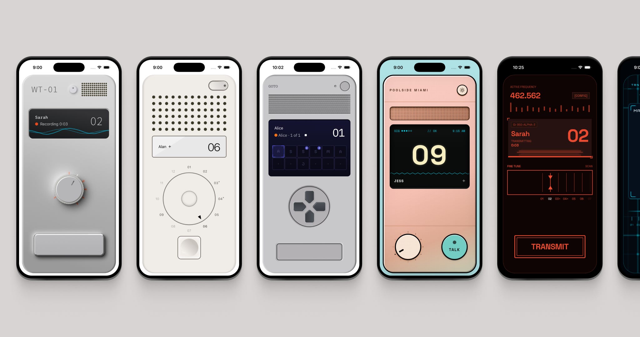
Copy is an async walkie-talkie app my friend Matt Moss and I are building. Hold push-to-talk, speak, and let go. Your friends listen whenever they’re ready. You start by picking the device you want to hold.
The system behind those devices has carried nine of them so far, built by two people with different processes, and it’s about to start taking designs from other designers and builders.
Each device has its own design, motion, sounds, and haptics. Underneath, every device has to handle the same friends, channels, messages, errors, settings, and gestures.
Copy is meant to feel like a real device. That was one of the early design constraints Matt and I set. Every time we hit a UX question (settings, pairing, dark mode, empty states) the answer was the same: what would this look like on a physical device?
That constraint made Copy easier to design but it also multiplied the work. Every new device had to carry every state, every color, and every mode on its own.
So the challenge was deciding what Copy handles once, and what each device is allowed to break.
Four jobs underneath every device
I designed the first four devices in Figma, then built them in React Native with Claude and Codex. I knew we wanted to keep making more device skins, so as I built I started mapping out the shared jobs every device would need.
As I found them, I wrote the decisions into a theming guide inside the repo. THEMING.md became the place Matt, the coding tools, and I could all check how a device should work.
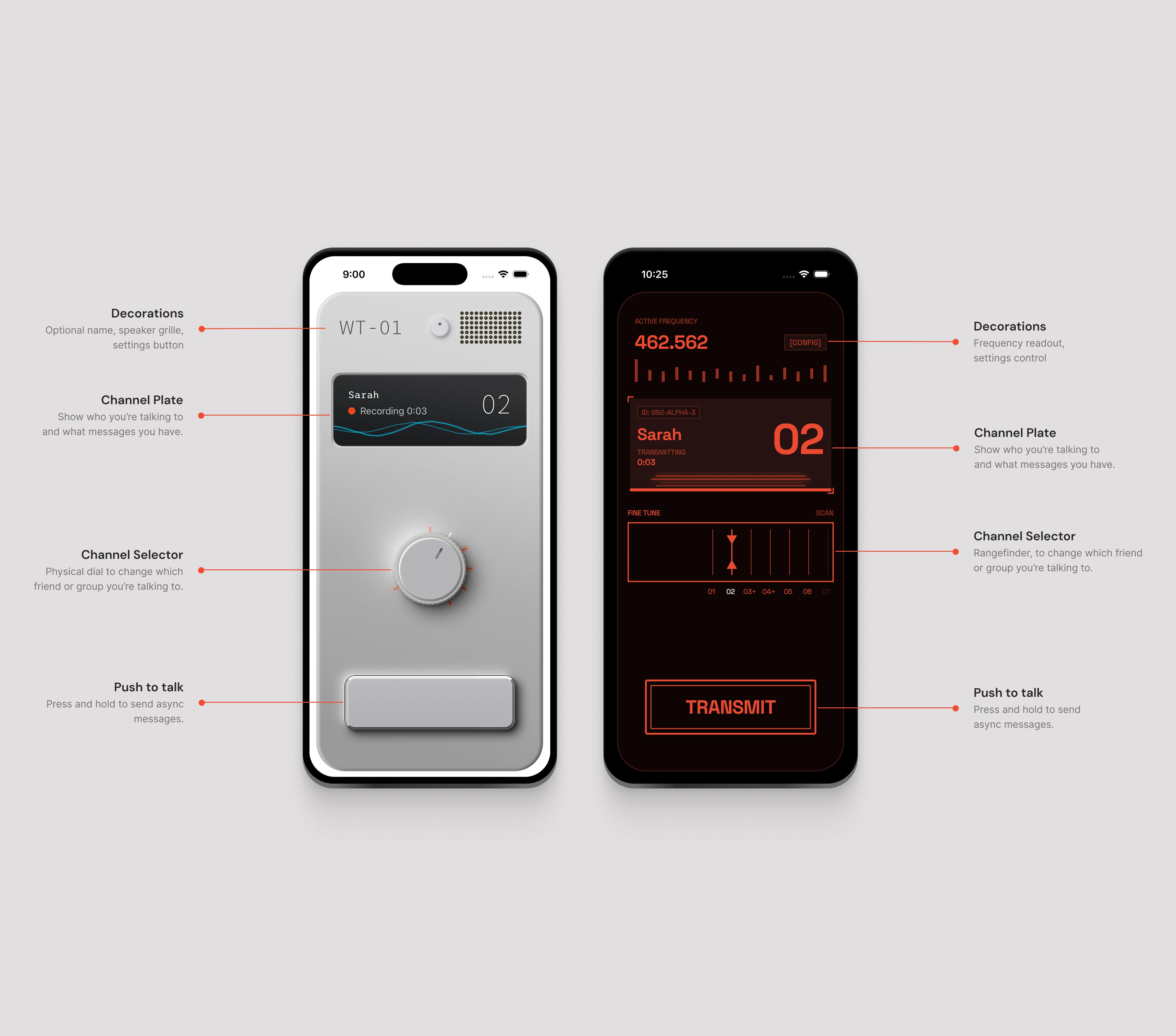
At the top of each device is a decoration area, which also carries the device’s settings control. On WT-01 that means speaker holes and a physical settings button. On Interlinked it means moving graphs and a small control inside the display.
Below that is a channel plate. It has to show who you are talking to and what’s happening: a message playing, a friend joining, a recording being sent, or an error.
Then the channel selector and the push-to-talk button. You pick a friend, hold the button, talk, and let go to send.
Those were the four initial shared jobs: decoration, channel plate, channel selector, and push-to-talk. As Copy grew, the same system expanded to cover sound, haptics, lighting, color, accessibility, and every state the device has to display.
WT-01 is our homage to Teenage Engineering. Clean chrome, sharp lighting, little speaker holes at the top. The channel selector needed to feel like a real knurled knob you could turn. The LCD sits inset in the body. The settings button and push-to-talk button look like physical controls you could actually press.
Interlinked is more sci-fi meant to feel like something you’d see in Blade Runner. Moving graphs, a rangefinder-style channel selector, more screen than hardware.
Rams asked what a walkie-talkie would have looked like if Dieter Rams designed one. It keeps the physical-radio language, with a rotary dial and a small indented push-to-talk button.
Goto pulled from Teiyu Goto’s PlayStation-era work. A memory-card grid sits inside the channel plate, with a D-pad below it for moving through channels. It still feels like a device you’re holding, just from a completely different family of hardware.
Copy is on the App Store if you want to hold one of the devices in hand while you read.
What the device decides
Finding the four shared jobs was the first part to figure out. The next was drawing a clear line between what a device author needs to decide and what Copy handles.
A device defines its visual identity. Copy handles the product behavior underneath it.
That line lives in the theming guide because people and AI coding tools both use it. Before a new device is built, the guide asks two questions.
Is its body a physical object or a digital display? A physical device gets hardware-like lights and controls. A display can change its on-screen elements without breaking the illusion.
Does color tint one base device or repaint the full palette? A tint device gets the shared lighting and color layers. A palette device supplies a complete set of colors for each treatment.
Those answers connect the device to the right parts of Copy. Every channel plate gets the same product states, messages, and accessibility labels. Tint devices get the same color and lighting math. The designer decides how all of that looks and feels on the device.
Turn the channel selector on any device and it drags, clicks, and snaps to the channel the same way every time. The knurled knob on WT-01, the smooth rotary on Rams, and Ghostline’s frequency dial look nothing alike but underneath they behave identically.
Each device uses a set of shared components. When a design needs something outside that component list, I stop and see if that capability should be a part of Copy. If it does, I build it once and add it to the shared system.
Here’s the split, condensed out of THEMING.md
Declare intent, not behavior.
A skin defines a visual identity. Shared behavior lives in
shared primitives the skin opts into based on what you declared.

You specify                    Copy handles
- Theme tokens                 - Channel plate state derivation
- Component implementations    - Shared-state accessibility labels
- At least four treatments     - Rotary drag, snap, wraparound
- Light/dark behavior          - Color and lighting math, if you tint
Writing the rules down also changed how the coding tools worked. My coding agent kept simulating shadows because it thought I had an older version of React Native that couldn’t draw complex shadows. Once I figured out it was approximating instead of being exact, I wrote the rule down:
THEMING.md

React Native 0.76+ on the New Architecture supports CSS-like boxShadow. Use it
directly instead of the legacy shadow properties.
This is essential for neumorphic/skeuomorphic skins like WT-01, Rams, Goto etc.

boxShadow: "1.692px 1.692px 8.462px 0px rgba(49,51,62,0.81),
            -1.128px -1.128px 8.462px 2.256px #FFF"

No external libraries needed. Copy shadow values directly
from Figma's CSS output.
New behavior has a path too. It gets added to the checklist and to the examples that power our tests and review gallery. The current test suite opens every registered device in every channel and push-to-talk state. It catches crashes and helps us spot missing shared behavior across the other devices while we are working on one. We also have a dev mode that lets us look through the same cases to test them visually.
That lets the shared product keep changing while each device keeps its own design language.
The structure can bend
Goto bends the rules twice. The memory-card grid in its channel plate is itself a channel selector, and the D-pad below it is a second one. Two visible ways to move through channels, both wired to the same underlying job. The system has a defined place for that override, so Goto gets its second selector without Copy needing to carry a special case.
Poolside came next, the first device I built completely in code. It keeps all four jobs, with its speaker as the decoration up top, but the two main controls sit side by side. Heavy gradients give the whole thing an 80s Miami feel.
Flux uses a dial to change channels, but the rest of the device goes in a very different sci-fi direction. Its selector holds a floating icosahedron that grows and warps while you talk.
Interlinked, Goto, Poolside, and Flux all keep the same channels and push-to-talk behavior while arranging the controls differently and using their own visual language.
Every part of Copy had to belong to the device
The four initial jobs handled the main components, but there’s so much more that makes up a Copy device. Over time, we needed sound, haptics, settings, pairing, error and empty states that all had to follow the same device rule.
The first settings control was a little icon floating in the corner. It worked, but it felt bad. You were supposed to be holding WT-01 in your hand, and a flat app icon was sitting on top of it.
I went back into Figma and designed a control for each device. On WT-01 it became a physical button you could press. On Flux it became the sys.cfg control inside the display. Both open the same settings, but each one belongs to the thing you’re holding. This became a new rule in THEMING.md: every device needs a settings control that matches its design.
Errors followed the same rule. When we needed error messages, the standard app answers were toasts and pop-ups. We didn’t want an app pattern sitting on top of the device. So errors show up on the channel plate, through the device’s own display, the way a real device tells you something went wrong.
Once you have Copy installed, you need to pair it with a friend before you can talk. The original version of pairing was a QR code you could scan or a code to type in. The camera and code-entry screen pulled you away from the walkie-talkie, so Matt and I moved the invite into iMessage. You send someone a link and the pairing happens behind the scenes.
Matt pushed it further while we were working on pairing. He moved the friend confirmation out of an overlay and onto the channel plate itself. The device just tells you in the channel plate when someone connects instead of it being an overlay or a toast.
Empty channels needed their own treatment too. WT-01 lights up ridges around the dial. Rams uses glowing channel numbers. Goto puts plus signs into its memory-card save slots. Interlinked uses open circles in the rangefinder. Same empty-channel state, drawn four different ways that fit the hardware.
The physical rule also shaped sound and haptics. WT-01’s dial snaps as you turn it. The push-to-talk button moves when you press down. The devices react to your voice differently too. WT-01 has a waveform. Goto uses scanlines. Flux’s icosahedron grows and changes shape while you talk.
You turn something, feel it click, press the button, and see the device respond to your voice.
Designing each device once
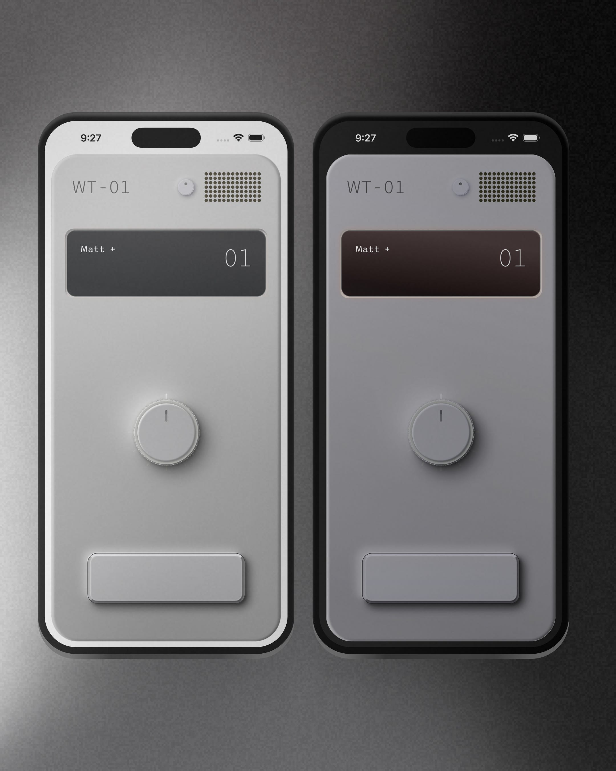
After the first four devices, some of our early testers were asking for dark mode. Color options were coming right behind it. One base design needed to carry all of those combinations.
Because the devices are meant to feel physical, I treated dark mode as lighting. It needed to feel like the light in the room had changed. A Braun radio doesn’t become a different radio at night. You’re holding the same object in a darker room.
I started by changing each device by hand in Figma. I adjusted the shadows and added a soft glow to the channel plate. It looked right, but every new device would need another night pass. Then another pass for every color.
So the lighting became a layer over the same materials and controls.
Color works the same way for some devices. WT-01, Rams, Goto, and Poolside use a tint over one base design: the dimensions, type, materials, and shadows stay the same while a color layer changes the cast of the device, and the night lighting rides on top as its own layer. The system checks how dark the tinted body would become. If the color and night layers together would make the controls hard to read, it backs off the tint.
Other devices swap their complete palettes instead. Flux, Interlinked, and End of Line each supply a full set of colors for every treatment. The product behavior stays put, but every surface can take on a different color.
Light and dark mode are separate from color. Interlinked is a dark cyberpunk display, so it stays dark in both modes.
The same system tints WT-01, repaints Flux, and leaves Interlinked dark. Those choices are set once for each device, then reused across its screens and states.
Two co-builders, different processes
Next, Matt and I worked on two devices around the same time. I built Poolside. Matt built End of Line.


Matt didn’t use Figma. He made mockups in code first, then brought the device into the same shared structure.
End of Line has a draggable light-trail channel selector, an identity-disc push-to-talk button, moving circuits, its own voice-reactive display, and a full set of sounds. Its color options repaint the whole device instead of tinting one base design.
It looks like Matt’s work because it is. The system gave both of us the same channels, messages, errors, and gestures without asking us to use the same design process. Matt got room to work in HTML instead of Figma and arrive at his own visual answer. I built Poolside in code. Matt built End of Line in code. Both still felt like Copy.
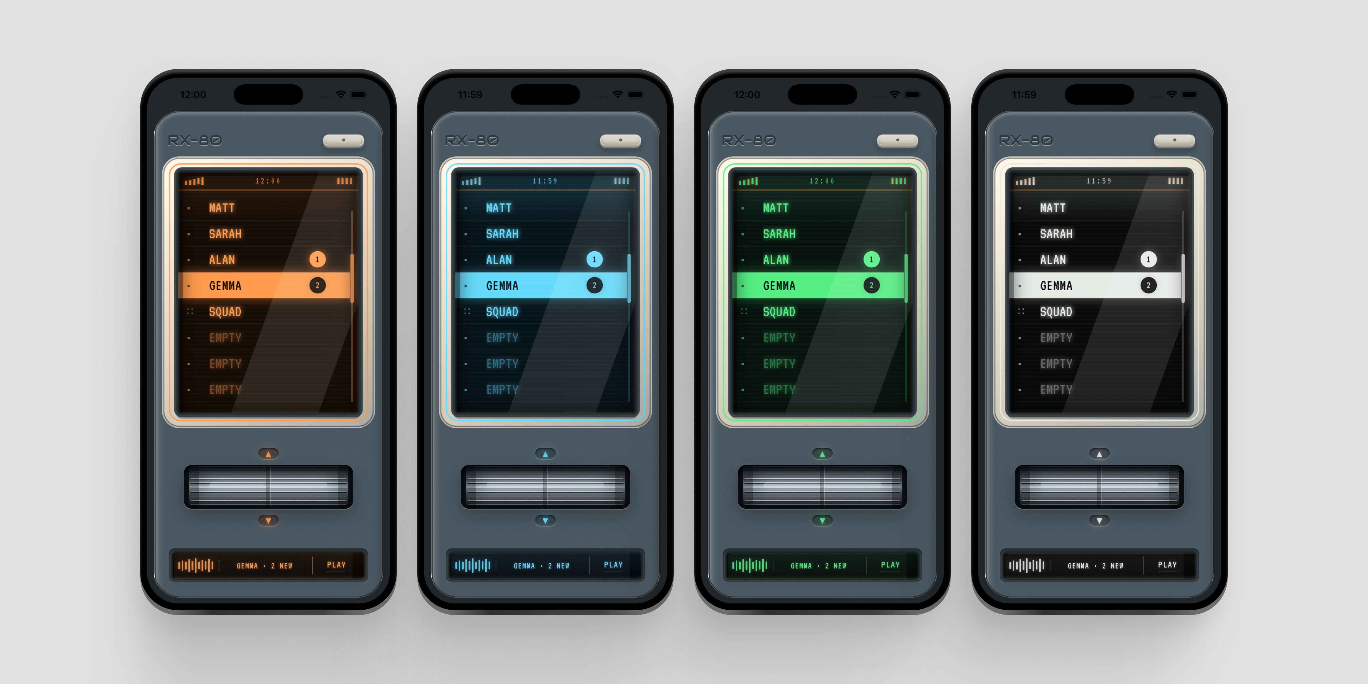
Matt came back to the same structure for RX-80, a handheld device in gunmetal with a machined deck and a larger channel plate LCD. Instead of a dial, it has a roller you spin to change channels and a mini LCD that shows channel status like joining a channel and sending.
That’s two devices Matt designed his own way, both running on the shared system without Copy carrying a special case for either one.
Opening Copy to other creators
Matt and I have always wanted to open Copy up to other creators. The old Winamp days are the reference, when people made their own skins and changed how the software looked. We want Copy to have some of that same energy.
For that to happen, bringing a new design into Copy has to be something anyone can do. Right now that takes Matt or me. I’m building a process that takes a design made in code and brings it into Copy with the product behavior already connected.
Ghostline was the first full test of the new import process.
It started as an unfinished tactical radio prototype I made in Claude Design. The pipeline keeps that original design untouched and hands my coding tools the source next to the rules I’ve already written in the theming guide, then asks them to map one to the other. Anything unclear stops and waits for my call.
That run exposed where the process still relied on Matt or me knowing what to check. The existing devices already handled rotary alignment, snapping, haptics, and message lights, but a new import could still miss them without the process stopping it. I built shared components for new imports, added those behaviors to the checks, and ran it again.
By the final pass, most of Copy’s behavior came through in one shot. The slate body, frequency dial, screen, and recessed push-to-talk button carried over from the original design. The dial became Copy’s 12-channel selector with the shared snapping, haptics, sounds, and accessibility already working.
Ghostline still took far less time than the earlier devices. The shared system already handled the product behavior and had tests covering it, so I spent my time on how the device looked and felt instead of checking every message and error state by hand.
Ghostline will be releasing soon in the next App Store build.
Next, I want the same process to work with a design straight from Figma.
After that, Matt and I want to open it to designers and builders outside Copy. You’d get to design an entire device: its controls, display, color, motion, and sound. The shared system handles Copy underneath it, so your time goes into making the device feel like yours.
The first authors will be people comfortable in Figma, prototyping in code or both. Matt and I will help you get the skin ready to ship in Copy.
We’re still working out the exact business model, but we absolutely want creators to get paid for their work.
Want to make one?
Join the waitlist to make a skin for Copy
Download Copy to try the devices yourself.